Follow

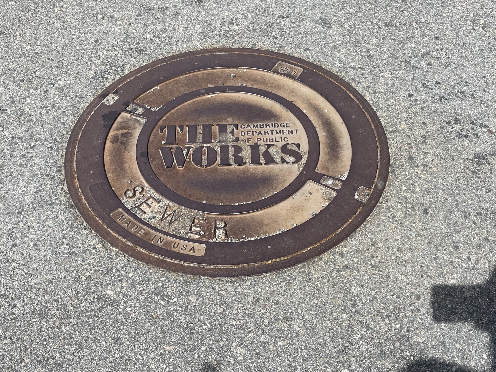
Cambridge Department of Public Works’ branding in general, and as implemented on these utility covers in particular, is undefeated.
I choose to believe that “The Works” was the result of a ‘Parks and Rec” style. employee submission contest.

@bikepedantic Maybe a Queen fan was involved. The font is similar to the one used on their 1984 album cover.
https://www.allmusic.com/album/the-works-mw0000191494