Darlinghurst mapped: Google vs Public Sydney
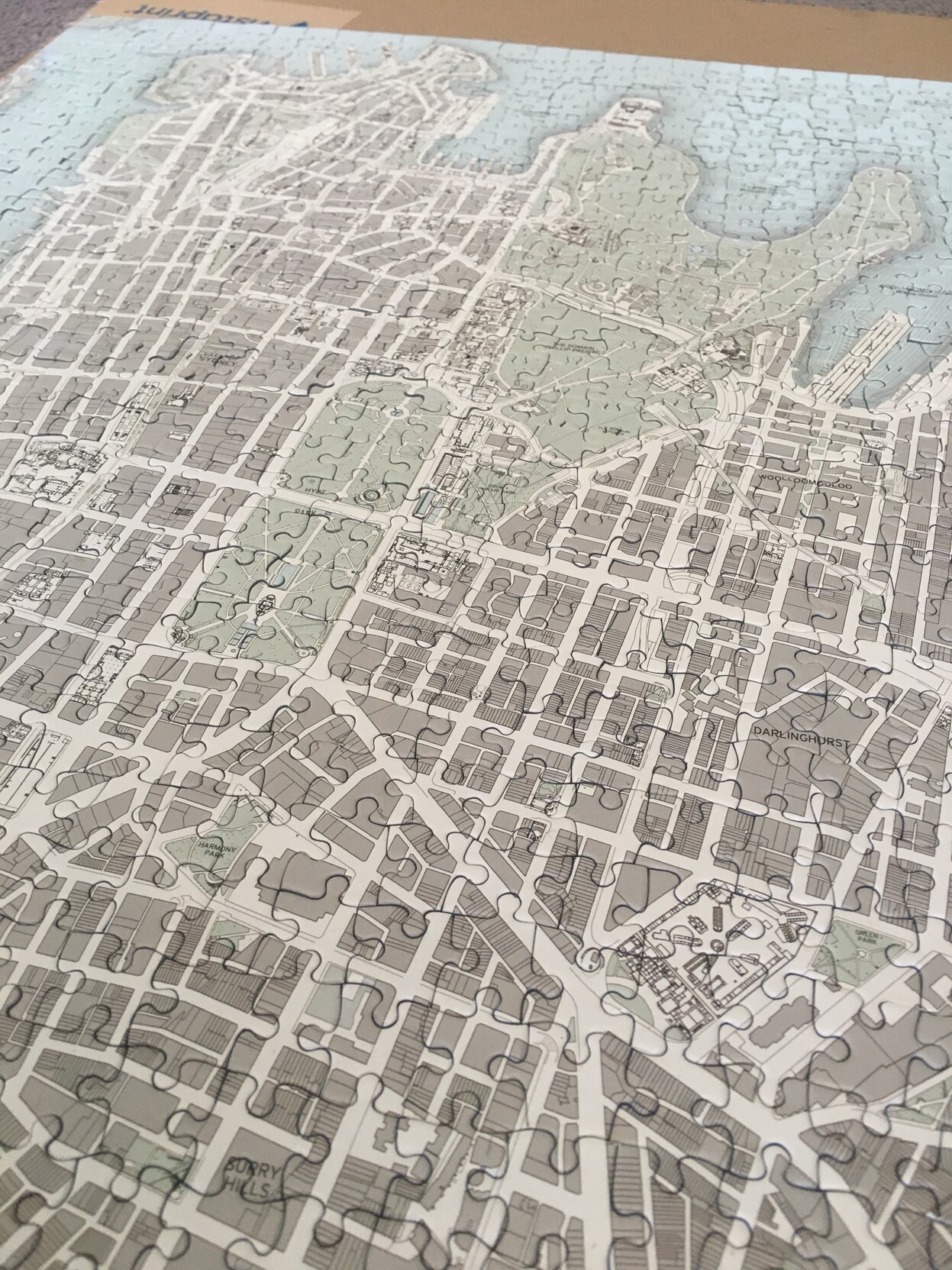
Spent a few too many hours since Christmas doing my Public Sydney puzzle the slow way - without looking at the picture or other maps to help!
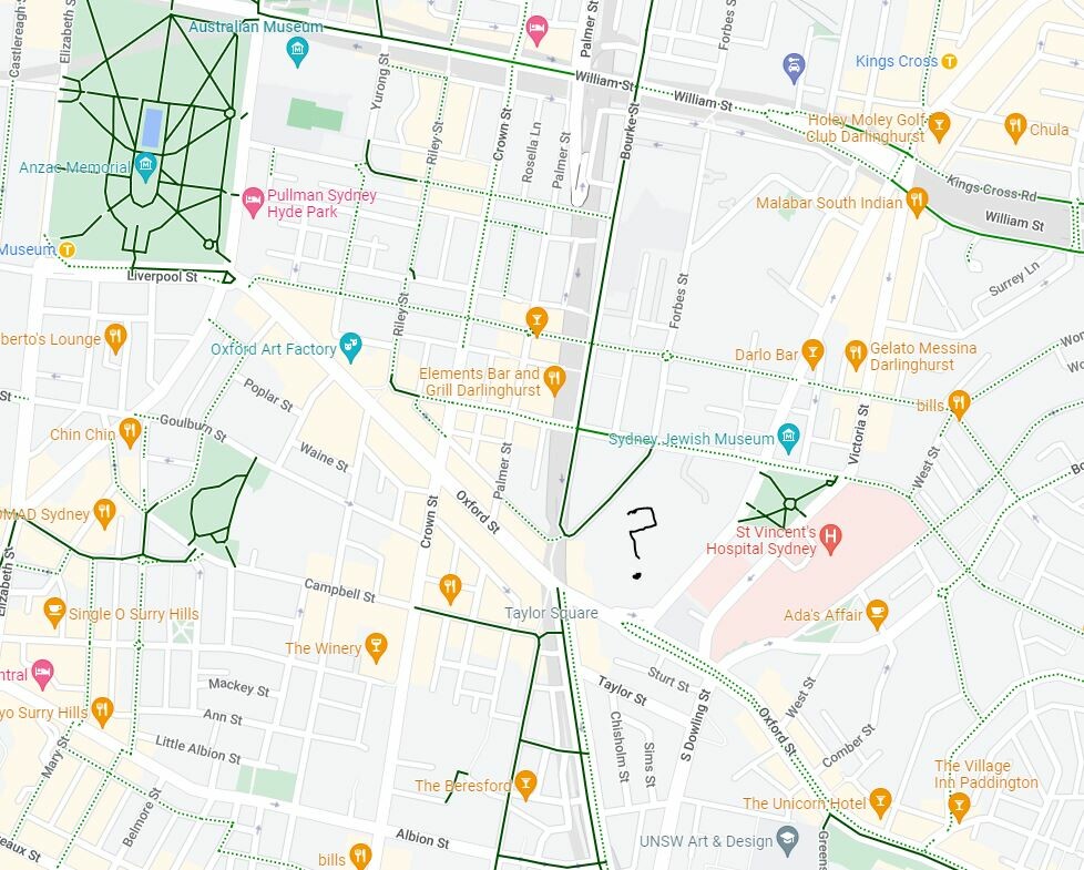
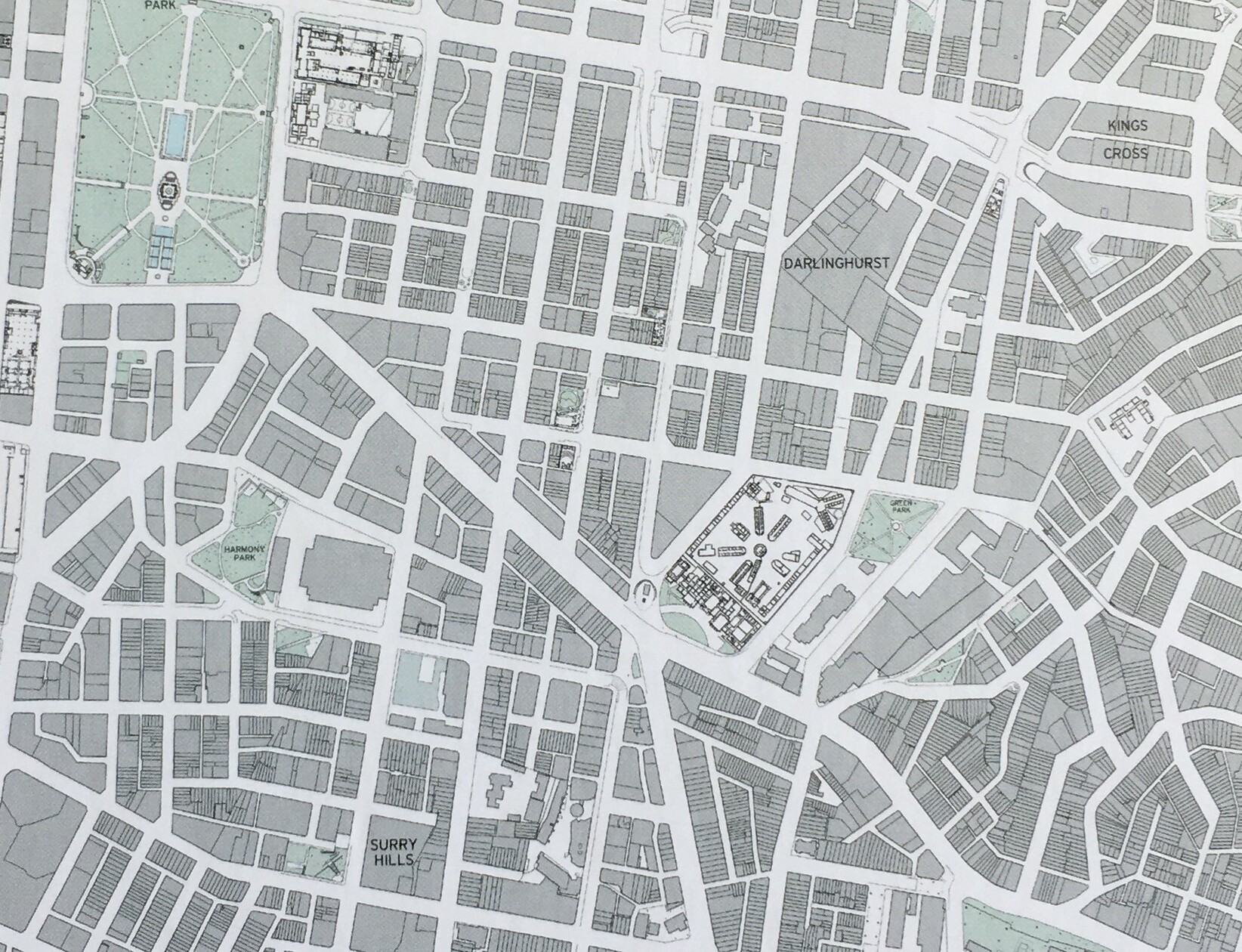
The complex in the middle here puzzled me - I had no idea what or where it was. Turns out it's the National Art School, in the marvellous historic buildings of one of our oldest prisons: https://nas.edu.au/history/
Anyway, it really brought home the different perceptions of a city via different maps (cont)
Follow
Oh yeah, this is what it looks like as a puzzle (used the box picture for clarity before). Now I've got to work out what to do with it.